A brand, refreshed*
TELUS Brand photography, also refreshed**
The context
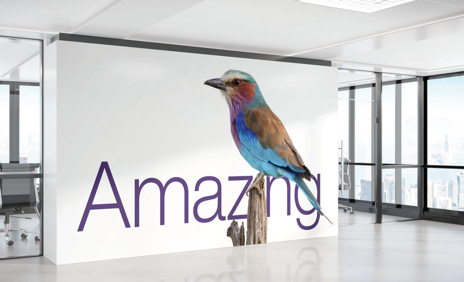
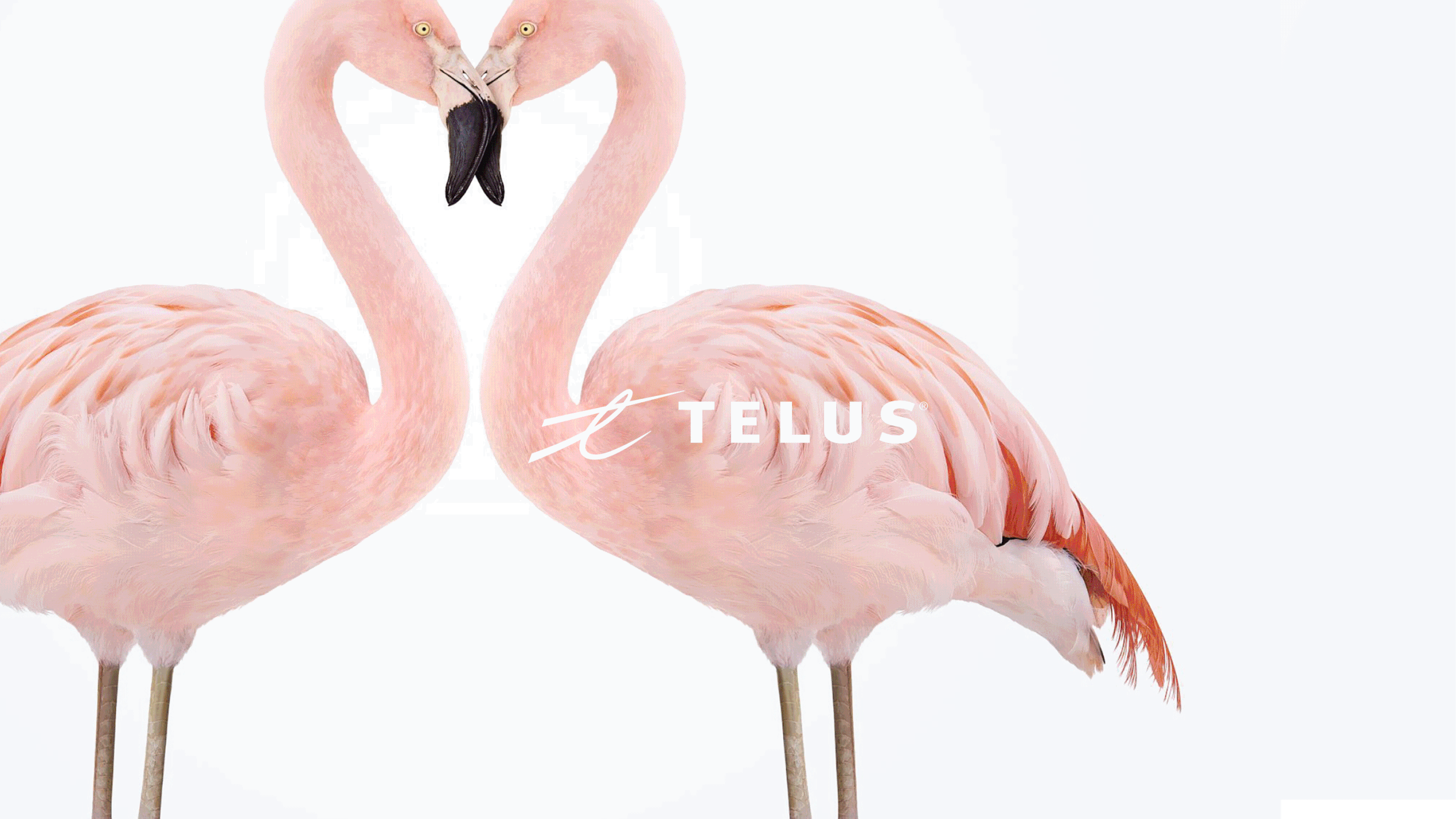
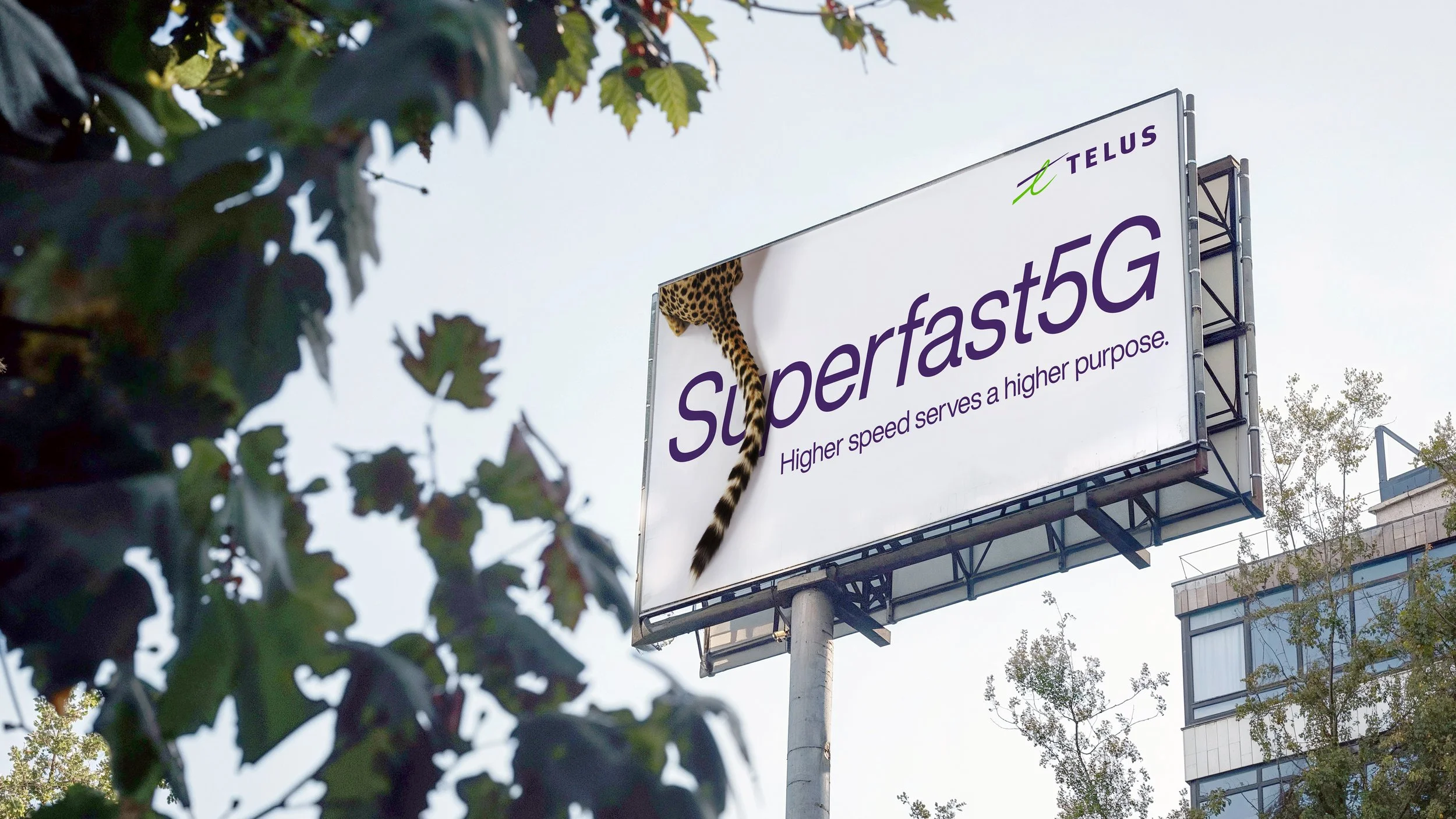
TELUS saw a shift in how they present themselves to Canadians—by putting their social purpose at the forefront of everything they do. With that, came a new brand positioning: Let’s make the future friendly. A small tweak to the past 20 years, but an important shift to be inclusive to all of what they do, and who they do it for. This posed the perfect chance to revitalize the way TELUS tells stories, and refresh how they look. A clean, modern and authentic visual identity was born.
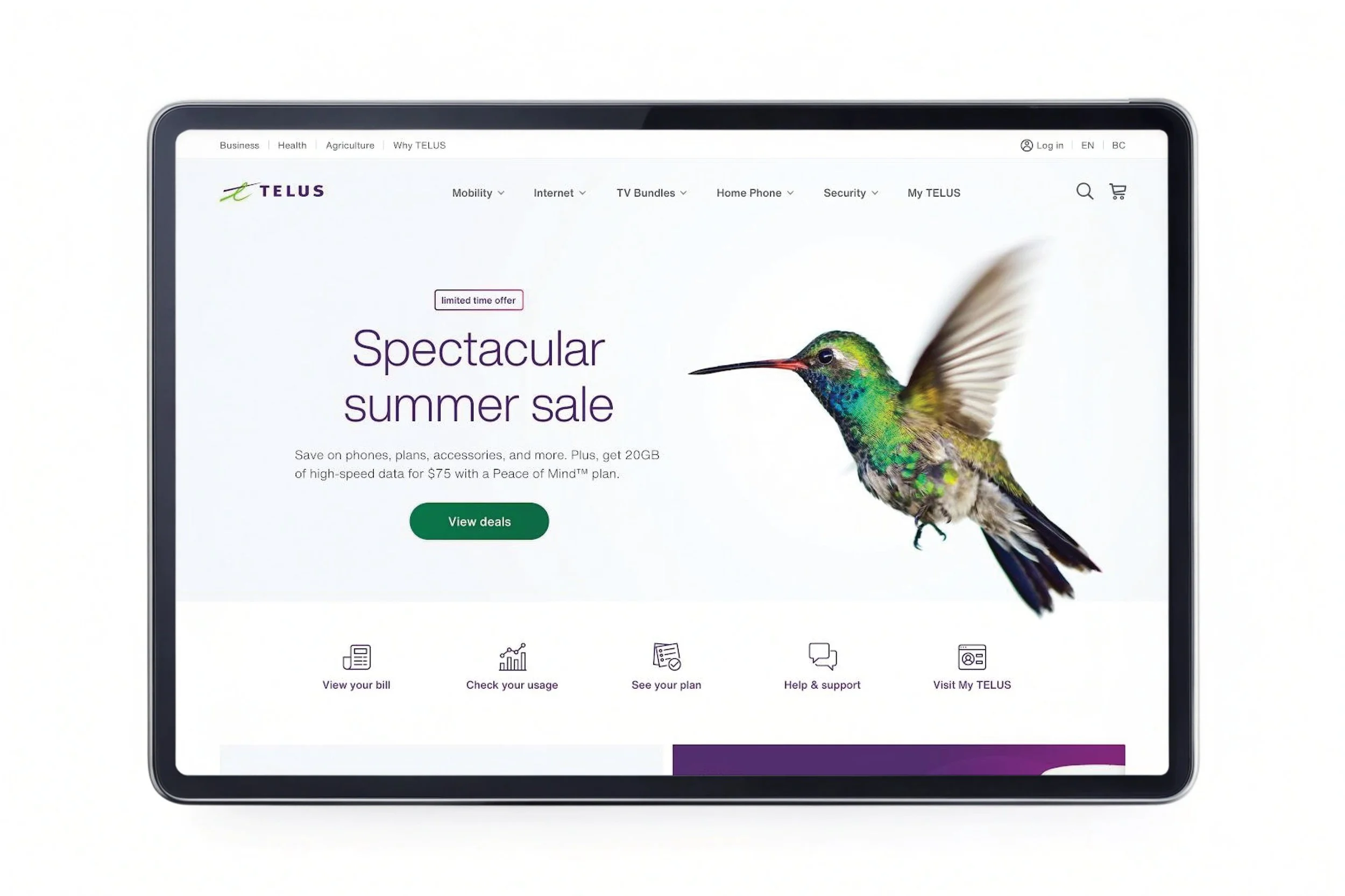

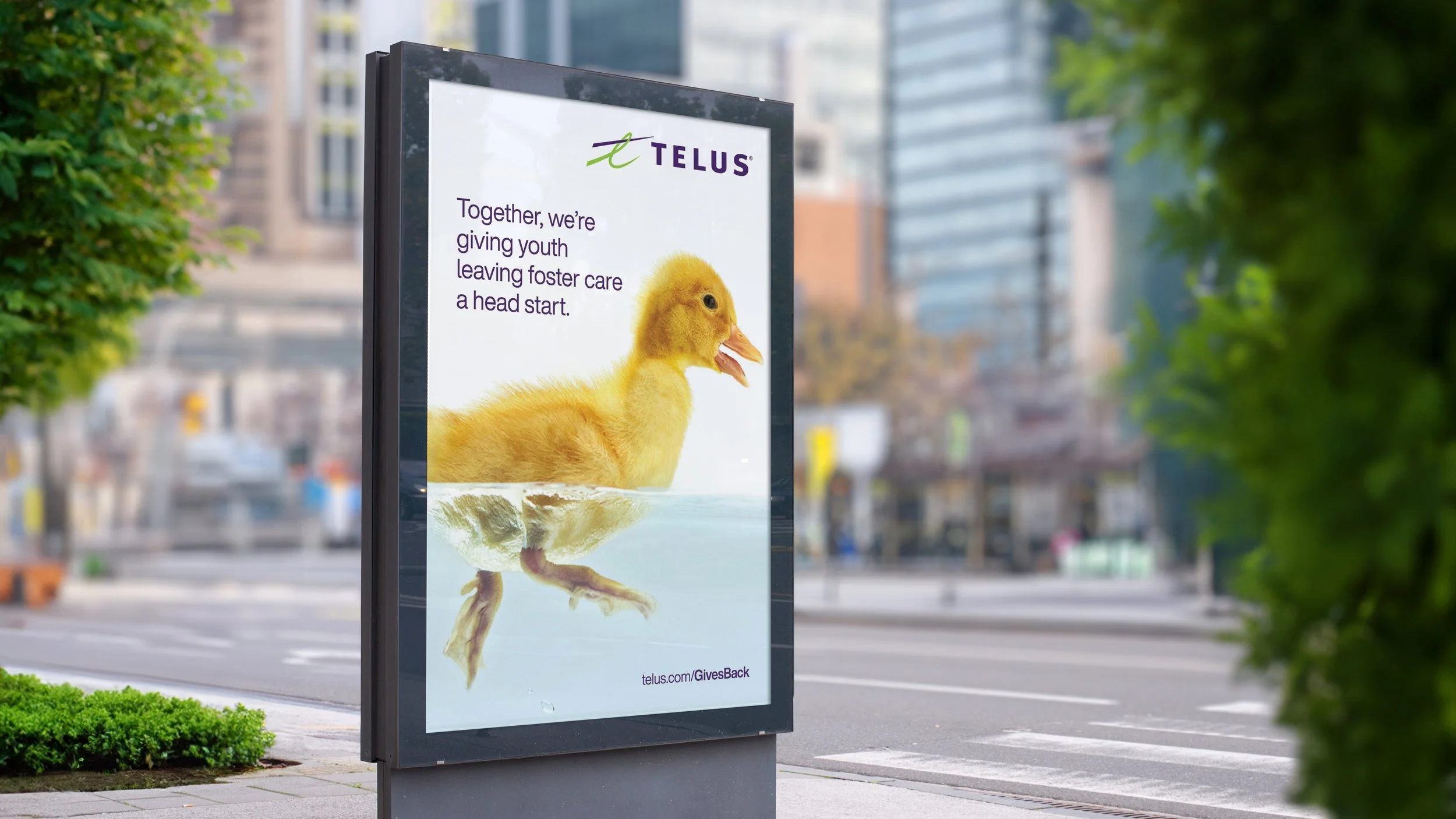
Fresh photography focused on highlighting all of the little details that the TELUS critters are known for—keeping charm and warmth at the heart of it. A refined palette was introduced, with an expanded set of gradients to work online and in-store. A new font for the ages was chosen, Helvetica Now, to tackle a larger range of viewpoints and uses, all with accessibility in mind.